aspect ratio
US
・UK
B2 中高級
n.名詞長寬比
The aspect ratio of this monitor is 16:9.
影片字幕
Figma 自動版型入門教學 (2025)!零基礎也能學會! (Figma Auto Layout Tutorial for Beginners (2025))
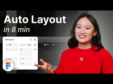
- This arranges your elements vertically The third one is Horizontal It arranges your elements horizontally The fourth one is Grid This is a new update still in beta It allows you to edit the layout in a grid format We'll go over each of these in detail Don't worry, by the end of this video, you'll understand how to use every single button here Let us start with the Freeform setting You'll see W and H right below this button W stands for Width and H stands for Height You can use these fields to adjust the size of your element You can type in a number, hover over the letter and drag to change it Or do it the most organic way Hover over the edge of the element and drag until you see a number you like I like multiples of 4 To the right, you'll see a square icon If you click it, it locks the aspect ratio of the element So the width and height stay proportional Let's say you are redesigning a YouTube thumbnail A YouTube thumbnail has a specific aspect ratio So locking it can prevent your cat, your kid, and mostly you from messing it up One very, very important thing Make sure you select the right layer In a real design project, you'll have so many layers So if you want to lock the aspect ratio of this circle, let's say Make sure to select the circle, not the frame That way, your circle will stay perfectly as a circle Not too fat, not too short Below Width, you'll find a field to adjust the gap between elements This only appears in freeform mode when your elements share the same gap At the bottom, you'll see the clip content checkbox This is super helpful when your frame is smaller than the elements inside For example, in a carousel design Checking clip content will hide the parts of the elements that extend outside the frame Alright, next let's move on to vertical and horizontal layouts These two are really similar So let's take a look at the horizontal one When you select a horizontal layout A wrap icon will appear on the right If you click it, the elements inside the frame will automatically wrap into multiple rows Perfect for when there's not enough space in a single line Below that, you'll see width and height settings Each with a drop-down If you click the drop-down, you can set the size to hug This makes the frame automatically adjust to fit its contents For example, if you add a new circle to the frame The width will automatically expand to hug the new element You can also set minimum or maximum values for width and height Let's say you don't want the frame to be wider than 750 pixels Just set the max width to 750 And even if you add more elements, the frame won't go beyond that limit Right below width, you'll see nine alignment options for your elements inside the frame These let you align your content to the top, center, bottom, left, right Basically any corner or edge you want You might not notice much difference right now if your frame is hugging the elements But once the frame is bigger, this alignment will become very obvious Next is the gap setting Click the drop-down and you'll see an option to set it to auto This automatically adjusts the space between elements to fill the frame evenly So satisfying to see everything snap into place Below that are your padding settings Padding is the space between the edge of the frame and the element inside it By default, padding is applied equally on parallel sides But if you click the little toggle next to it, you can customize the padding for each side Just like this Next, let's move to grid A brand new and still in beta feature in Figma Alright, I have a love-hate relationship with this, okay?
第三個是橫向(Horizontal) 將元素橫向排列 第四個是網格(Grid) 這是一個新的更新,仍處於測試階段,它允許你以網格格式編輯佈局 我們將詳細介紹其中的每一個按鈕 別擔心,在本視頻結束時,你會明白如何使用這裡的每一個按鈕、讓我們從 "自由格式 "設置開始吧 你會看到 W 和 H 就在這個按鈕的下方 W 代表寬度,H 代表高度 你可以使用這些資料欄來調整元素的大小 你可以輸入一個數字,將鼠標懸停在字母上,然後拖動來更改它 或者用最簡單的方法 將鼠標懸停在元素的邊緣,然後拖動,直到看到你喜歡的數字為
- If you click it, it locks the aspect ratio of the element, so the width and height stay proportional.
LG 34WP65C-B 34吋超廣角螢幕評測! (LG 34WP65C-B 34" Ultrawide Monitor Review)
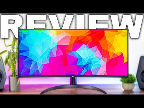
- So it's just gonna be a typical 1440p resolution with those extra pixels on the left and right because of the ultrawide 21 by 9 aspect ratio.
是以,它只是一個典型的 1440p 分辨率,左右兩邊多出的像素是因為超寬 21 x 9 的寬高比。
- So it's just going to be a typical 1440p resolution with those extra pixels on the left and right because of the ultrawide 21 by 9 aspect ratio.
它有一個 PPI 值,即每英寸像素數,表示影像、文字或遊戲的清晰度。
Sony 新的 999 美元相機 v.s. iPhone 15 Pro Max! (Sony’s new $999 camera vs. an iPhone 15 Pro Max)

- There's a bokeh mode that prioritizes settings for shallow depth of field, a CineVlog setting that changes the colors and aspect ratio in order to make things more cinematic, and a product showcase feature that automatically sets the focus to any object you hold up in front of you.
虛化模式可優先設置淺景深,CineVlog 設置可更改色彩和長寬比,使畫面更具電影效果,而產品展示功能則可自動將焦點設置為您面前的任何物體。
- There's a bokeh mode that prioritizes settings for shallow depth of field, a cinevlog setting that changes the colors and aspect ratio in order to make things more cinematic, and
選擇 ND 濾鏡可能會讓人一頭霧水,因為你必須知道鏡頭的螺紋尺寸,還必須知道你想阻擋多少光線。
DJI MAVIC 4 Pro | 絕美6K無限雲臺...終於等到你! (DJI MAVIC 4 Pro | STUNNING 6K Infinity Gimbal...Worth the wait!)
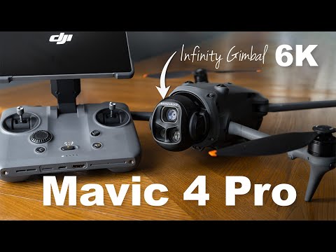
- Also if you're filming in that vertical aspect ratio for socials you can twist the seven inch screen for a better view and the gimbal follows suit.
此外,如果您要以垂直比例拍攝社交照片,您可以扭轉 7 英寸螢幕以獲得更好的視角,雲臺也會跟著扭轉。
- Also, if you're filming in that vertical aspect ratio for socials, you can twist the seven-inch screen for a better view and the gimbal follows suit.
原點將根據遙控器的位置不斷更新。
Android 平板困境大揭密! (The Android Tablet Problem)

- It's a 7 by 5 aspect ratio, so it's a little taller than a 16 by 9 widescreen.
它的寬高比為 7 x 5,是以比 16 x 9 寬屏幕略高一些。
- It's a 7: 5 aspect ratio, so it's a little taller than a 16: 9 wide screen,
然後你再去撿,它就沒電了,這很煩人。
牠們不用燃料就能飛200英里?方法在這裡! (They can fly 200 miles with no fuel. Here's how.)

- Its aspect ratio, the difference between its width and length, is much greater.
它的展弦比,也就是寬度跟長度的比例,大很多。
- Its aspect ratio, the difference between its width and length, is much greater.
它的展弦比,也就是寬度跟長度的比例,大很多。
史帝芬索德堡如何讓一個(小)場景瞬間升級?! (How Soderbergh Elevates A (Minor) Scene)

- These compositions waste none of the Y239 aspect ratio.
這些成分沒有浪費任何 Y239 長寬比。
- These compositions waste none of the Y239 aspect ratio.
它們給人一種生活的感覺。
2024年必看!十大現代黑白電影推薦! (Top 10 Modern Black And White Movies)

- Along with the boxed aspect ratio, the film creates a claustrophobic sentiment.
配合方形的畫面比例,這部電影營造出一種幽閉恐懼的感覺。
- Along with the boxed aspect ratio, the film creates a claustrophobic sentiment through Jared Blaschka's black-and-white cinematography.
黑白不僅讓我們感覺被傳送到另一個世界,也被傳送到另一個心靈層面。